Long before the “Coalition of the Willing”, there was synergy of a different kind between the United States and Australia – found in the designs of their football cards! In the 1960’s & 70s, many non-sport series were reproduced under licence from Topps in the US, and many sports card designs were adopted & adapted for local conditions.
The sixties in Australia was a simple time – Dad went to work while mum stayed at home in the kitchen, football was played on a Saturday, and kids stayed inside long enough to down a vegemite sandwich and a glass of milk before they raced back outside, playing madly until dark.
It seems to be also have been a time when the Scanlens Sweet company, who produced famous gum products for years in Australia, were without design initiative (or designers) when it came to their very own sports cards.
Times have changed on all these fronts – workplace equality, the football merry-go-round leaves us unsure where or when our team will play, and kids prefer computer simulated games to any actual physical activity.
Likewise Australian sports card manufacturers have designers the equal of any other country, but for a moment, lets cast our gaze back to a simpler time when this wasn’t as apparent…
 |
 |
|
Topps NFL 1959
A classic design for this set of 176 cards, incorporating 5 or 6 different “pattern” background |
Scanlens 1963
Smaller card, with smaller writing, no team or position on front, poorer quality photos, and a basic |
 |
 |
|
Topps NFL 1966 The classic “TV” series of cards appeared |
Scanlens 1967 Almost identical TV woodgrain effect, lettering |
 |
 |
|
Topps NFL 1967 Another colourful Topps set, with a full |
Scanlens 1968 A The “horse-shoe” series otherwise known as 1968 “A” – the first set released in 1968. Multiple colours in the arched borders, and once again,a puzzle on the rear. This design was virtually repeated in 1978 |
 |
 |
|
Topps NFL 1968 A really nice set by Topps, great shots, |
Scanlens 1969 A real yearly cycle is evident here – the front of these two cards is virtually identical. Once again the rear makes up a large puzzle. Unlike the US |
 |
 |
|
Topps NFL 1968 Die Cut/Stand-ups A smaller sub-set of “Stand-ups” complimented |
Scanlens 1969 Die Cut/Stand-ups Almost identical to the Topps stand-ups |
 |
 |
|
Topps NFL 1973 A whopping set of cards released by Topps |
Scanlens 1974 Practically identical in every way, this |
 |
 |
|
Topps NFL 1978 A mixture of player portrait, training |
Scanlens 1979 In keeping with some of the less than inspiring |
 |
 |
|
Topps 1965 Baseball One of the most popular baseball sets of |
Scanlens VFL 1966 Any other year and this passing resemblance |
 |
 |
|
Topps Baseball 1968 Another popular set by Topps which features |
Scanlens Football 1970 & 1972 With the exception of the VFL logo and |
 |
 |
|
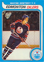
Topps/O Pee Chee 1979/80 Ice Hockey Blue border with a sash leading down to a circle containing the hockey team’s logo. |
Scanlens Football 1980 With the exception of the VFL logo and the name being shifted from the top to the bottom of the card, the Scanlens release is very, very similar. |
 |
|
|
Fleer US AFL football 1960 Topp’s rival, Fleer, released football |
Select retro 2003 From 2003 Select “retro” set of 32 cards. There is more than a passing similarity with the 1960 set |
 |
 |
|
Topps NFL football 1956 The early years of Topp’s football saw this basic design hit the streets – and it was a huge hit with |
Select retro 2009 From the 2009 Select “retro” set of 36 cards. How they get away with this is anyone’s guess, and why Select would not want to do an Australian “retro” design instead of copy a (pretty crummy) one from the US is puzzling. I don’t relate because I grew up in Australia – do you? |

